Pantone’s Quiet Year
Pantone announced its 2026 Color of the Year: white.
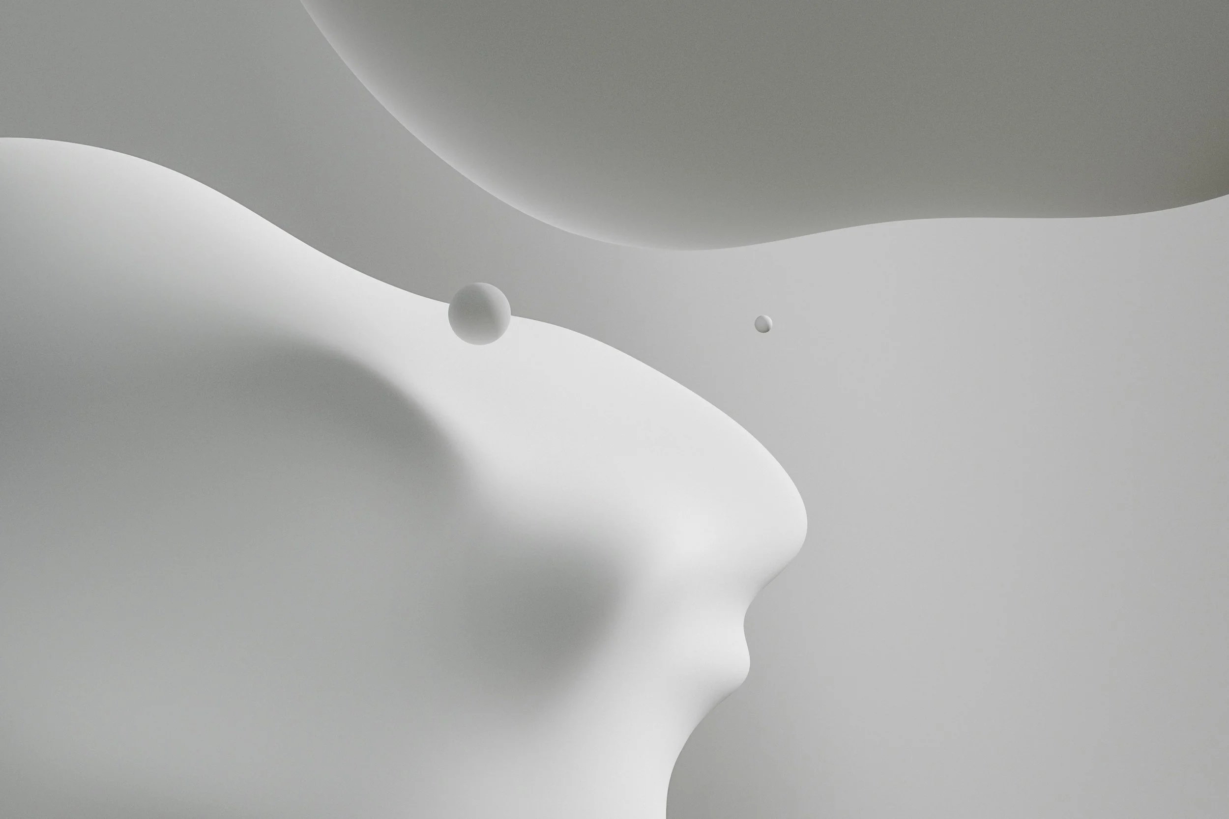
Cloud Dancer.
Almost immediately, the response followed a familiar script. Surprise. Disbelief. Irritation. Any color but white. Surely this was unimaginative. Surely it was tone-deaf. Surely it's a mistake.
So let me start by saying this without qualifying language or preemptive defense:
I like it.
Not to be provocative or contra. I like it for the simple fact that it makes sense. Aesthetic cycles close the way seasons do—slowly, predictably, and often toward quiet. After years of emotionally saturated color—symbolic, warm, grounding, soothing—we were always going to arrive here.
White is a resolution—whether it’s the white flag of surrender, the foam of a crashing wave after impact, or the hum that noise becomes after our minds are spent.
In 2022, Very Peri carried digital optimism and speculative energy. In 2023, Viva Magenta leaned into bodily intensity and emotional force. By 2024, Peach Fuzz softened the edges, offering care and gentleness. In 2025, Mocha Mousse grounded us fully in comfort, materiality, and domestic warmth. Each color did its work. None of them were meant to linger forever.
Eventually, saturation gives way to space.
Pantone framed Cloud Dancer—a lofty white—as a response to global chaos: calm, clarity, quiet reflection. A neutral reset. That framing alone seemed to enrage people. Critics rushed to ask what, exactly, was innovative about spotlighting a color already everywhere. Appliances are white. Walls are white. Furniture is white. Was this bold, or just lazy?
But innovation has never been about novelty alone. Sometimes innovation is naming what people are already reaching for and legitimizing the pause they’re afraid to take.
And if the last few years have taught us anything, it’s that the pause is overdue. We have been asked to process too much, too quickly, with no space between crises. Social, political, technological, environmental—everything has arrived at once, demanding reaction, opinion, performance. Even design has been pressed into service as emotional labor.
A pause, in that context, is a form of recovery.
What’s striking about the backlash is how quickly reduction gets mistaken for absence. White is read as empty rather than open. As evasive rather than spacious. As though restraint itself were a moral failure.
But white has always been a sensory color. It is felt before it is analyzed.
There is the quiet satisfaction of something new and untouched—socks or an undershirt fresh from its packaging, cream just whipped, a page before the first word is written. These are not abstract ideas. They are ordinary, shared experiences. They register in the body before they ever become symbolic.
White carries promise because it leaves room.
Much of the criticism also assumes that choosing white is somehow exclusionary or culturally inaccessible. I find that assumption far more troubling than the color itself. The idea that certain groups cannot recognize or relate to the feeling of freshness, clarity, or anticipation embedded in white flattens human experience into stereotype. It suggests culture only exists at full saturation, only at maximum volume.
Color does not erase meaning on its own. Meaning disappears only when designers, brands, or institutions mistake neutrality for universality—when a backdrop is treated as a conclusion instead of an invitation.
Pantone, for all its influence, is not a cultural author. It is a barometer. Its selections reflect where mass aesthetics have already landed, not where they should aspire to go. Treating the Color of the Year as an ideological directive gives it far more power than it actually holds.
And for real, not every moment of quiet is suspect. Not every pull toward simplicity is regressive. Sometimes, restraint is just restraint. Sometimes the most honest response to years of visual and emotional noise is to clear the surface and begin again.
What matters now is not rejecting the color, but refusing to let it stand alone. White asks to be layered, inhabited, interrupted…personalized. It demands intention. It exposes laziness quickly. It shows us exactly what we choose to place on top of it.
So yes—Pantone chose white for 2026.
And yes—I like it.
Not because it is neutral, or safe, or elevated, but because it is open. Because it understands that cycles end. Because it acknowledges that the pause has been earned.
Cloud Dancer feels less like an answer and more like a breath. And after everything, a breath feels necessary.