A civic identity built to stay recognizable and work harder.
Eveleth already has a strong visual identity rooted in Iron Range history, hockey tradition, and public life. This refresh strengthens the system around that identity so City staff can use it with greater consistency across print, digital, templates, public notices, and recurring communications.
A stronger system around a familiar identity.
The value of this refresh is practical: clearer tools for staff, stronger visual consistency, and a system that can move across the places residents encounter City information.
The work centers on logo typography, type recommendations, color, supporting graphic elements, accessibility, and organized final files. Each decision is developed with everyday municipal use in mind, including the website, Microsoft products, Canva, print materials, public notices, and recurring communications.
Six parts designed to work together.
Logo typography
Refine the existing mark through typography and proportion so it feels more deliberate and reproduces consistently.
Practical type system
Type recommendations for web and print, with usable matches for Canva and Microsoft products.
Color system
Refreshed primary, secondary, and grayscale palettes tested for contrast, legibility, and everyday application.
Visual extensions
Three to four graphic elements that give staff more ways to carry the identity across web, print, and recurring materials.
Readable by design
Color and typography choices reviewed with accessibility, contrast, hierarchy, and public readability in mind.
Organized handoff
Packaged source files, exports, usage notes, and practical guidance for staff and outside vendors.
A focused refresh built around how the City actually works.
Review
Current logo, brand guide, website needs, newsletter use, accessibility requirements, and staff production environment.
Refine
Logo typography, type recommendations, primary and secondary palettes, grayscale applications, and accessibility testing.
Extend
Supporting graphic elements and application examples show how the system carries across City communications.
Equip
Final files, usage notes, and an organized handoff give staff a dependable system for continued use.
Logo typography, type recommendations, palette refresh, accessibility review, supporting graphic elements, usage notes, and packaged design files.
InDesign-based quarterly template using the refreshed system, with flexible structures for updates, features, notices, photography, captions, and recurring information.
Core brand refresh plus the quarterly print newsletter template. Additional work outside the agreed scope is $115/hour with prior approval.
The larger body of work behind the proposal.
FOCUS Magazine
Editorial direction and publication design for civic storytelling, developed first as vendor work and later managed from inside municipal communications.
Communications Department Design
Structure, standards, workflows, and visual systems developed to support public communication across City departments.
Cain Park 2025 Season
A public arts campaign designed to remain recognizable across posters, calendars, social graphics, stickers, and changing event information.
Cain Park Arts Fest
Event identity and campaign materials developed across print, digital, social, and public-facing applications.
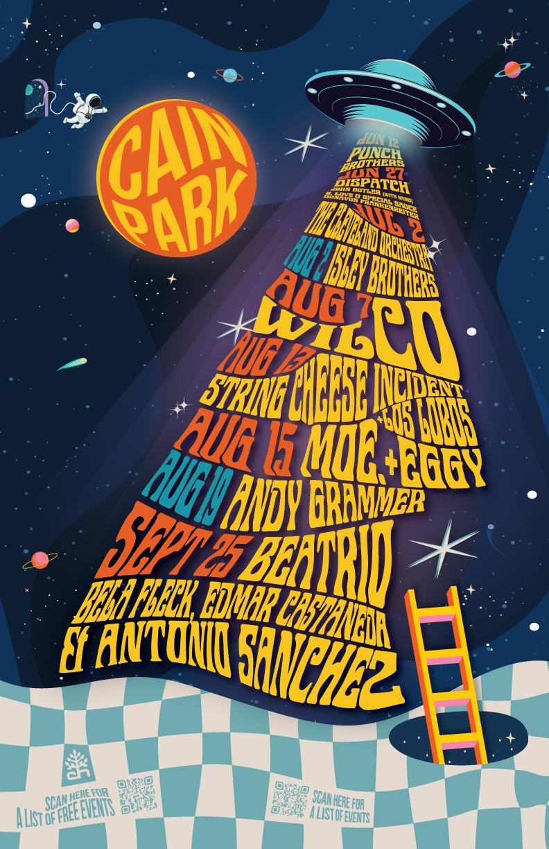
One identity, many applications.
The 2025 Cain Park season required a visual language that could carry a large amount of changing information while remaining recognizable from one application to the next.
That same discipline applies to a municipal brand refresh. Typography, color, supporting graphics, and layout rules need enough character to be recognizable and enough structure to keep working across different formats, staff needs, and production environments.
Design judgment and communications judgment in the same system.
My background combines municipal communications leadership with publication design, visual systems, public information, civic events, reports, and staff-ready tools.
I have worked on public-facing design from both sides of municipal government: first as an outside creative partner and later from inside a City communications operation. That experience shapes how I approach systems intended for daily staff use, public visibility, and long-term continuity.
A familiar civic identity with stronger tools behind it.
I would welcome the opportunity to help Eveleth strengthen its visual system and give staff a practical set of tools for consistent public communication.
View project one-sheetFrances Eugenia Design
frances@franceseugenia.com
(231) 321-1100
franceseugenia.com